You’ve probably walked past the same blank wall for months, telling yourself you’ll “figure it out later.” Then one rainy Saturday you spot your neighbor’s perfectly hung gallery wall through their window, that’s when it hits you: there’s an actual method to this madness, not just hope and a hammer.
Seven steps separate your chaotic pile of frames from that cohesive, magazine-worthy display, and the first one starts on your floor, not your drywall. You’ll map, measure, and mock up before a single nail pierces plaster, saving yourself from the patch-and-repaint cycle that ruins weekends.
The trick isn’t buying expensive art, it’s treating arrangement like a puzzle with rules: anchor big, build diagonal, keep gaps tight. But here’s the catch nobody mentions, the step that separates amateur clusters from pro-level balance, it’s the one most people skip entirely.
Map Your Gallery Wall Layout on the Floor First
Before you grab a hammer or commit a single nail to your wall, you’ll want to map your gallery layout on the floor first. Start by taking measurements of your total wall space, then tape off a matching floor box to represent that exact area. This creates your canvas for experimentation.
Lay every frame inside your floor box and test layout options freely. You’ll shift pieces around, check balance, and nail down wall placement without damaging anything. For tricky stairway walls, stretch a diagonal guide line across your floor layout to handle angles properly.
Once satisfied, snap a reference photo. During wall transfer, use that image plus your measurements to mark nail locations precisely. Some prefer giant paper templates; either way, your floor work becomes your reliable blueprint.
Choose a Color Palette That Unifies Your Collection
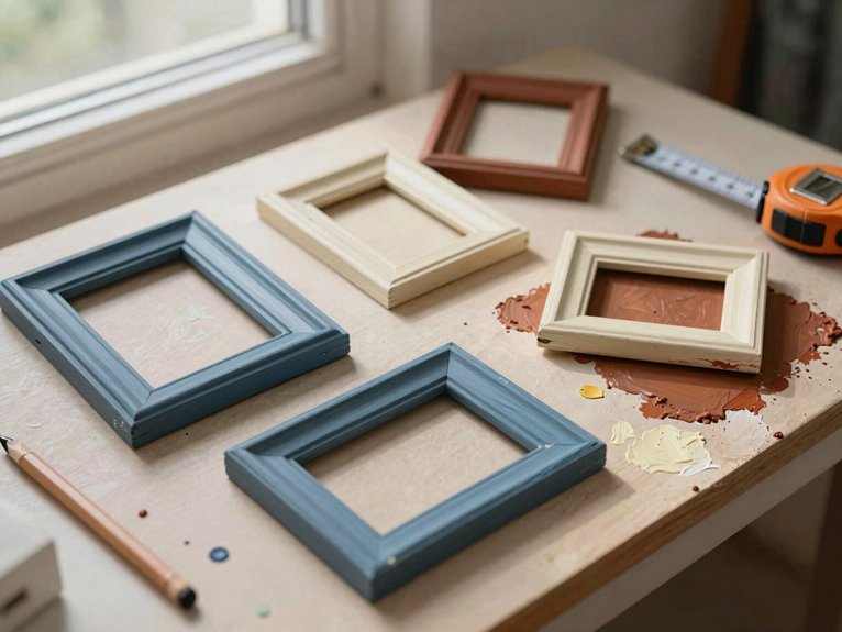
Even if your frames are arranged well, a chaotic mix of colors will make your gallery wall feel like a jumbled flea market find rather than a curated collection. You’ll want to lock in a COLOR PALETTE before hanging anything. Stick with cohesive color families: neutrals, blues, and gold accents work well together without fighting for attention.
This doesn’t mean everything matches exactly; you’re building a unified display, not a boring grid. Keep your tones and intensities similar so your wall decor reads as intentional. When you lay out pieces on the floor, step back and squint. If one piece screams while others whisper, swap it out.
Your frame styles can vary, but your color story shouldn’t. A restrained palette lets you create mini grids and mix orientations without visual chaos. Trust this: cohesive color transforms scattered art into gallery-worthy impact.
Mix Frame Styles and Textures for Curated Depth
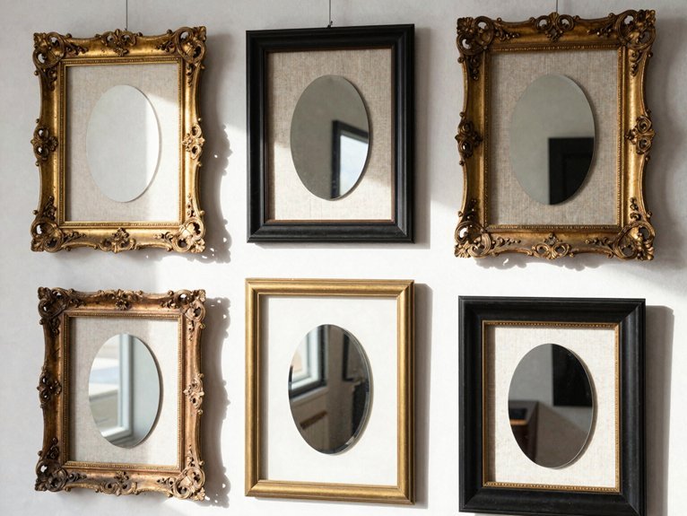
Once you’ve locked in your color palette, it’s time to think about what actually holds your art: the frames. You’ll want to mix frame styles to create visual depth without chaos. Start with three options: white, black, and wood frames. This trio gives your gallery wall structure while keeping things interesting.
The secret to a striking gallery wall? Start with three frame colors—white, black, and wood—for instant structure without the chaos.
Next, layer in textures. Alternate matte, glossy, and metallic finishes to add tactile contrast across your display. These textures catch light differently, giving your wall dimension.
Balance matters. Pair larger anchor pieces with smaller surrounding frames, maintaining consistent spacing between each piece. You’ll create rhythm without rigidity.
Vary orientations too. Rotate horizontal and vertical frames to keep the eye moving. This organized approach ensures your cohesive display feels curated, not cluttered.
Anchor With Your Biggest Piece: Then Build Around It
The biggest piece in your collection isn’t just another frame, it’s the anchor that holds your entire gallery wall together. Start by positioning this largest item in one of the four outer corners, or place it slightly off-center if your collection runs smaller. This placement establishes your layout’s foundation immediately.
You’ll create visual progression by guiding the eye around the wall rather than letting it slam to the center. The biggest piece directs where everything else belongs, so trust its pull.
Surrounding pieces should fill gaps in a way that maintains natural balance across the entire arrangement. Your arrangement builds cohesive flow when smaller artworks support rather than compete with your anchor. Each placement decision reinforces what you’ve established, turning scattered frames into unified visual rhythm.
Position Your Second-Largest Piece Diagonally From the First
You’re creating a diagonal balance strategy when you place that second-biggest piece across from your anchor, which immediately pulls the eye into motion instead of letting it sit still. Keep both frames at similar heights so your imaginary line stays crisp, and leave breathing room between them for the smaller stuff you’ll add next.
This diagonal setup locks in your visual flow control early, so you won’t end up with a lopsided mess or awkward dead zones once the wall fills up.
Diagonal Balance Strategy
Why settle for a stiff, grid-locked gallery wall when you can build energy that actually moves the eye? You’re creating a diagonal balance that transforms your layout from boring to bold. Start by anchoring your largest piece, then position your second piece diagonally across from it. This slanted arrangement guides natural eye travel across the entire framing display.
Align your second piece’s top edge with the center of your anchor for smooth visual flow. Angle toward outer corners if placement feels off-center to encourage movement. Use this diagonal pairing as the backbone for filling in smaller frames around it. Test angles on your floor layout before committing holes to your wall.
You’ll maintain balance while avoiding rigid symmetry, crafting a gallery wall that feels intentional, cohesive, and alive.
Visual Flow Control
Once you’ve anchored your largest piece, grab that second-biggest frame and place it diagonally across from your anchor, roughly opposite and slightly offset to form an X or stair-step pattern that pulls the eye outward instead of letting it get stuck in the middle. This diagonal placement creates immediate movement across your gallery wall, establishing two strong focal points that work together rather than competing.
You’ll want offset alignment here, not perfect symmetry, so the arrangement feels collected and organic. This spacing prevents heavy central concentration and builds natural rhythm as you expand. Use this relationship to maintain balance when adding smaller frames, letting the diagonal anchor guide your growing composition with confident, purposeful movement.
Gap Filling Technique
The diagonal placement of your second-largest piece creates an instant visual pathway that breaks up predictable grid patterns and keeps the eye moving. You’ll anchor your gallery by placing the largest frame first, then position the second-largest diagonally to establish flow. This technique balances your wall art while guiding viewers through intentional negative space.
Offset centers along the same diagonal line to maintain rhythm. Leave equal spacing around both pieces to prevent crowding. Fill remaining gaps with smaller frames, working outward from your diagonal pair. Verify both centers align at eye level for comfortable viewing.
Check your spacing from a standing distance. You’re building a cohesive arrangement where each frame supports the next, creating professional balance without rigid symmetry.
Alternate Orientations and Keep Gaps Tight
How do you keep a gallery wall from feeling like a rigid grid? You alternate orientations. Mix horizontal and vertical frames to break visual monotony while maintaining balance. Start with larger anchors as grounding points, then arrange smaller pieces around them to guide the eye naturally. Keep tight spacing between frames, typically 2 to 6 inches, so the collection reads as one cohesive unit rather than scattered objects.
Before committing, do floor planning with paper templates to test your layout. This layout test lets you adjust gaps and orientations until the rhythm feels right. You’ll spot problems early and avoid unnecessary nail holes. Alternate orientations create energy; tight spacing creates unity. Together, they transform individual frames into a polished, professional statement.
Transfer Your Layout With Paper Templates
- Trace every frame including molding width for accurate framing representation
- Mark hardware locations clearly so wall hanging becomes foolproof
- Tape templates together to test configurations without wall commitment
- Mount nails through template markings, then peel away for clean layout transfer
This approach eliminates measuring errors and builds confidence.